按钮旋转边框的实现
首先看下效果

基础准备
<html>
<head>
<title>固定宽高比</title>
<style> body {
background: #000;
}
button {
width: 160px;
height: 80px;
font-size: 24px;
color: #0ebeff;
border: none;
outline: none;
z-index: 1;
border-radius: 10px;
cursor: pointer;
outline: 4px solid #fff;
background: #000;
position: relative;
}
button::before {
content: '';
position: absolute;
width: 200%;
height: 200%;
background: #f40;
}
</style>
</head>
<body>
<button>边框按钮</button>
</body>
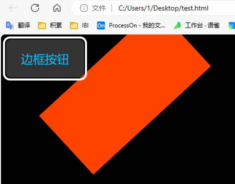
</html>给 button 加一个伪标签,效果如下

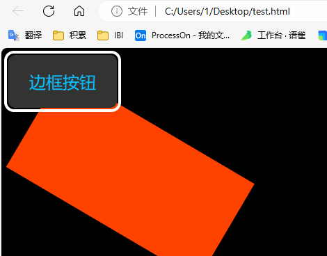
现在元素是覆盖上去的调整 z-index 顺序放在按钮的下面:z-index: -2;
button::before {
	content: '';
	position: absolute;
	width: 200%;
	height: 200%;
	background: #f40;
	z-index: -2;
}
调整伪元素中心,位于左上角
button::before {
    content: '';
    position: absolute;
    width: 200%;
    height: 200%;
    background: #f40;
    z-index: -2;
    /* 调整伪元素中心,位于左上角 */    left: 50%;
    right: 50%;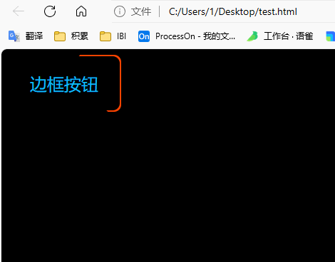
}按钮设置溢出隐藏overflow: hidden;,效果如下。这个红色的就是旋转的边框

怎么是边框呢,下图解析。黄色的就是看到的边框,我们要找个东西把绿色部分盖住。让这个整个红色部分沿着左上角旋转起来,就成了。

先遮住,在写一个伪元素 after,调整覆盖层级为-1
button::after {
    content: '';
    position: absolute;
    /* css 变量*/
    --w: 2px;
    width: calc(100% - 2 * var(--w));
    height: calc(100% - 2 * var(--w));
    left: var(--w);
    top: var(--w);
    background: #333;
    z-index: -1;
    border-radius: inherit;
}
写个动画让他动起来
button::before {
    content: '';
    position: absolute;
    width: 200%;
    height: 200%;
    background: #f40;
    z-index: -2;
    /* 调整伪元素中心,位于左上角 */    left: 50%;
    right: 50%;
    /* 加一个动画 */
    animation: rotation 3s linear infinite;
}

@keyframes rotation {
    to {
       transform: rotate(1turn);
    }
}
放开button的溢出隐藏注释看下效果,现在效果是这样的
设置下 after 的形变原点transform-origin: left top;
最终调整,把button的溢出隐藏注释放开、after的背景颜色调整成黑色、去掉button的外边框,效果如下
所有代码
<html>
<head>
    <title>固定宽高比</title>
    <style>       body {
          background: #000;
       }
       button {
          width: 160px;
          height: 80px;
          font-size: 24px;
          color: #0ebeff;
          border: none;
          outline: none;
          z-index: 1;
          border-radius: 10px;
          cursor: pointer;
          /*outline: 4px solid #fff;*/
          background: #000;
          position: relative;
          overflow: hidden;
       }

       button::before {
          content: '';
          position: absolute;
          width: 200%;
          height: 200%;
          background: #f40;
          z-index: -2;
          /* 调整伪元素中心,位于左上角 */          left: 50%;
          right: 50%;
          /* 设置形变原地 */          transform-origin: left top;
          animation: rotation 1s linear infinite;
       }

       button::after {
          content: '';
          position: absolute;
          /* css 变量*/
          --w: 2px;
          width: calc(100% - 2 * var(--w));
          height: calc(100% - 2 * var(--w));
          left: var(--w);
          top: var(--w);
          background: #000;
          z-index: -1;
          border-radius: inherit;
       }

       @keyframes rotation {
          to {
             transform: rotate(1turn);
          }
       }
    </style>
</head>

<body>
    <button>边框按钮</button>
</body>
</html>